A Hollyhocks and Rainbows Kitchen
Do you ever walk into a space and think, “this could be better”? That’s how my brain was every time I walked into our kitchen which meant it was time for a change. I was craving more color, more vibrancy and more fun! How does one add more color in a space with pink cabinets and a light blue range? In the form of a dream wallpaper, House of Hackney’s Hollyhocks. I have been admiring it for some time and it just felt so right.
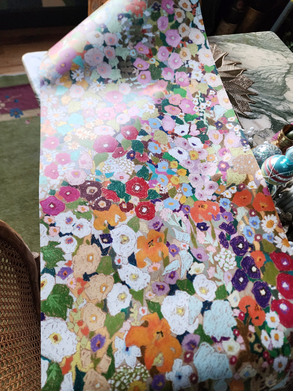
Bold, vibrant and whimsical baby
However this also meant I had to remove the old wallpaper from the ceiling, the part I was dreading the most. Oofs
But I was actually able to do it (almost exclusively by myself) relatively easily! We set up one large ladder on one side of the island and a small rolling scaffolding on the other side. My trusty steamer was KEY. It’s a wagner and I actually bought it for cleaning but the wallpaper removal attachment is the bomb. (For more detailed info on the tools and removal process click here)
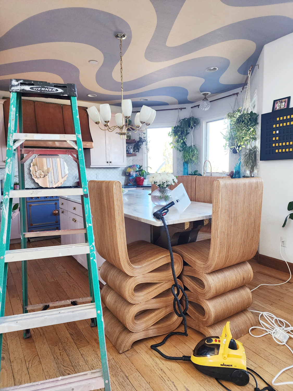
We tested it out by scoring the wallpaper first. They say this is necessary in order to allow the steam to penetrate through the paper reaching the adhesive and allows for easier removal.
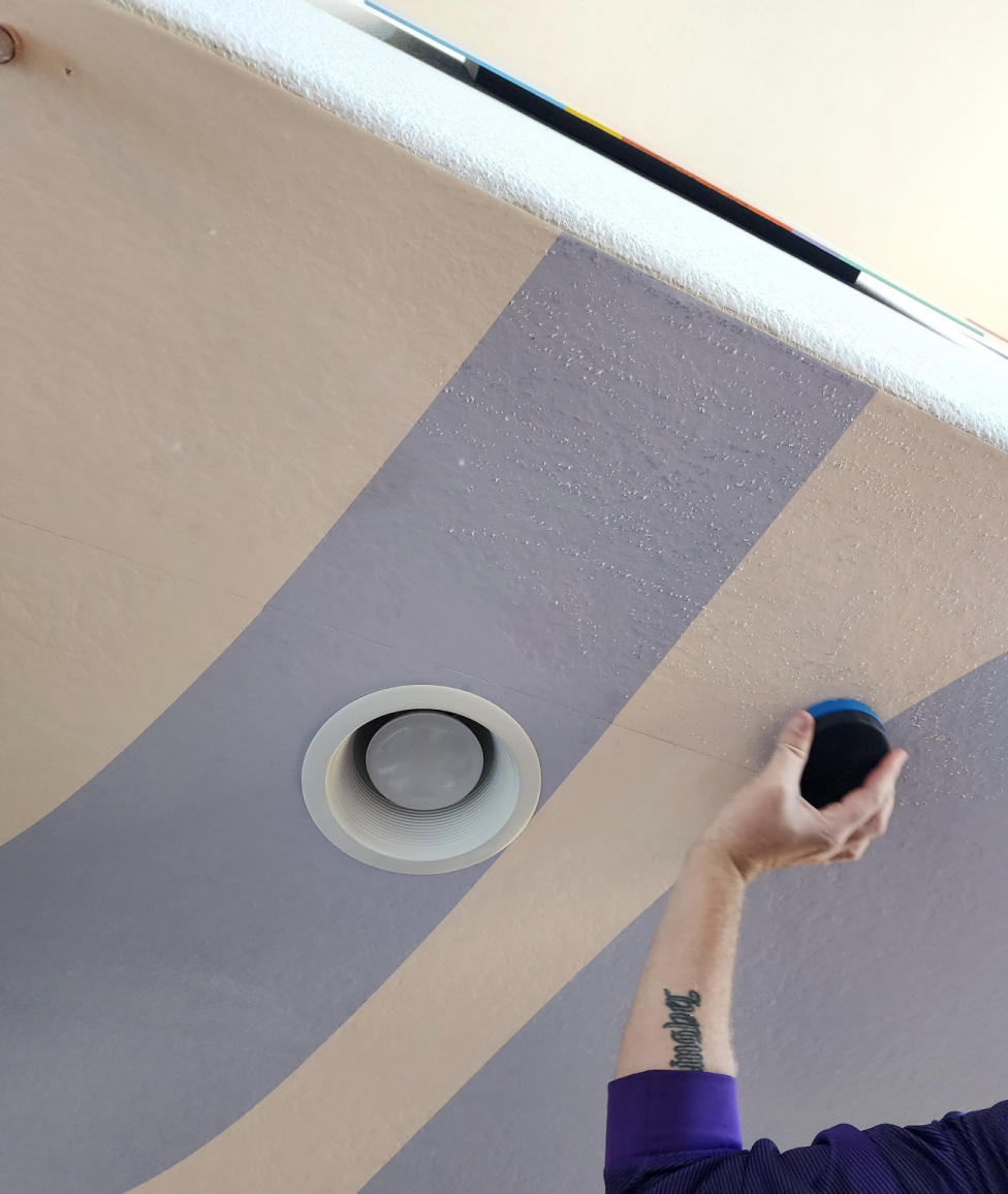
The paper came off in full strips which is SO satisfying. Although halfway through the removal I tried a piece without scoring it. I actually had BETTER results than the scoring section. I ended up with FAR less residual stuff when I didn’t score it. So in other words, the little white spots you see? That’s where some of the paper backing didn’t remove. When I didn’t score it I had much less of that happening.
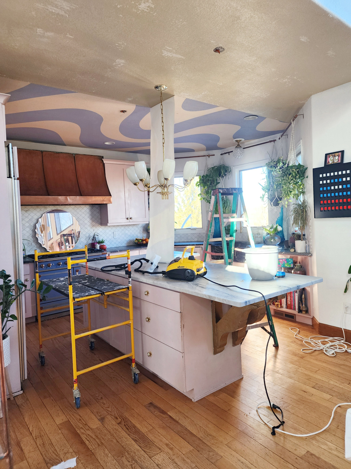
I’m still recommending you have a scoring tool on hand in case you need to do it for your paper/adhesive type but when I figured that out it saved me so much time. I just went steaming on down the rows without stopping to score first.
See the back half? Little to no white backing left behind, it’s crazy how that worked out. I did the whole ceiling in about 3 and a half hours. I had to stop twice to refill and reheat the steamer which took about 20 minutes each time.
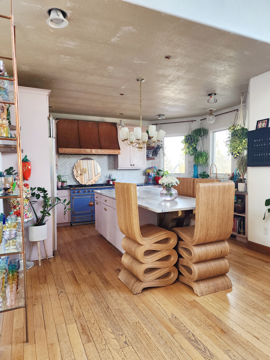
Eww that brown paint, see how it just dulls the entire room? It feels dingy and dirty. Fun fact, our entire house was painted this color when we bought it. 😬
Next up was install, I got my setup ready to roll along with my determination to get ‘er done. (For a detailed walk through on how I apply wallpaper check it out here)
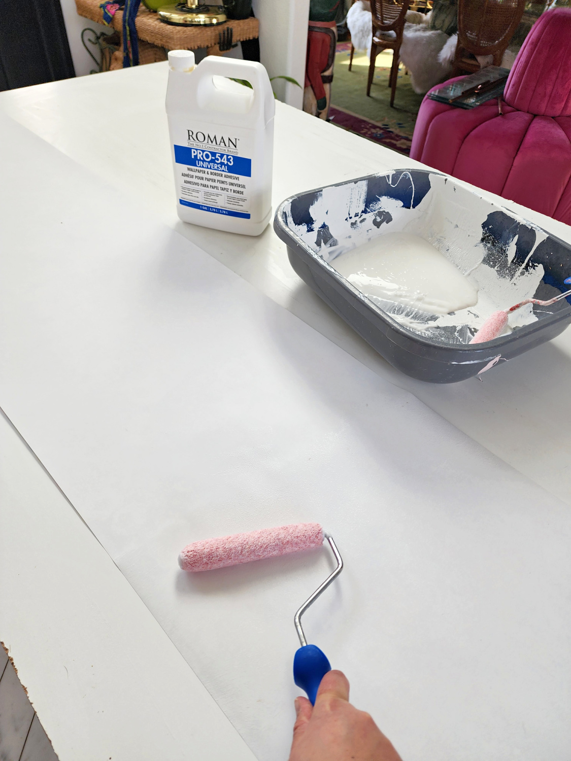
The first strip is key because this strip will determine the straight-ness of the rest of your paper. If it’s crooked at all that angle will carry through the rest of your ceiling/wall and create a problem with your pattern the farther you get.
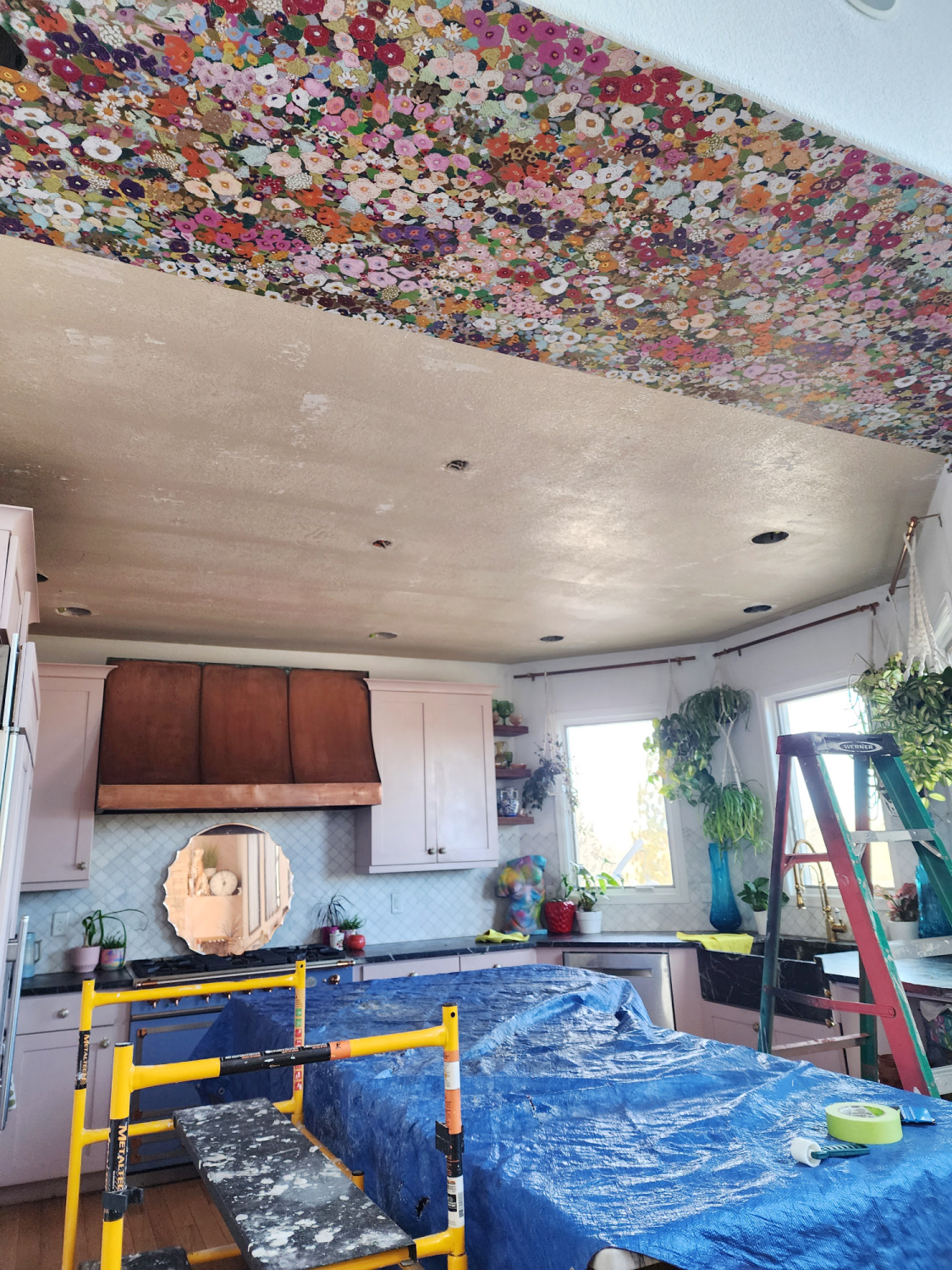
Here’s a close up with the second strip installed. You want overhang on both ends which you trim off for a clean line later.
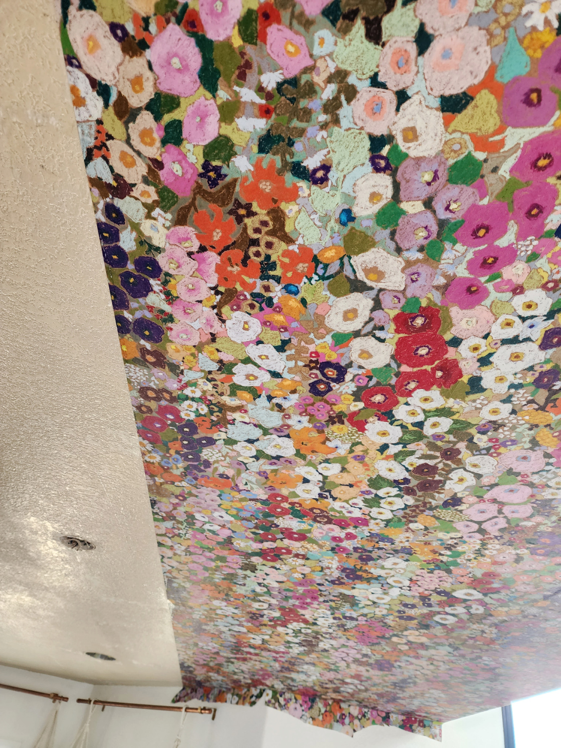
And the finished product!
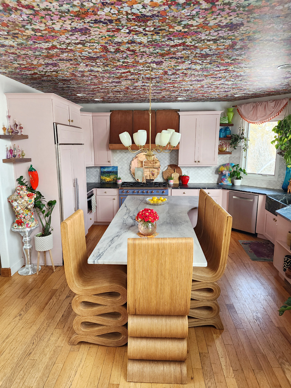
I love how warm but bright and inviting it feels now. Before it felt cold and just a bit flat.
Here’s a reminder from my Christmas post.

It really makes my rainbow glass pop and all of the colors flow together beautifully.

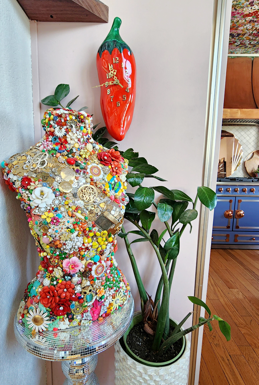
Shifting over by the fridge I have my jeweled mannequin and a thrifted chili pepper clock for extra oomph and to carry the color down from the ceiling.
Moving farther into the kitchen here’s my la cornue cornufe 110 (see my review of it here). The challenge in finding a new wallpaper was something that would bring both the soft pink (Antoinette by Annie Sloan Chalk Paint, see how I painted them here) and the light blue together. I think the Hollyhocks was the perfect missing piece!
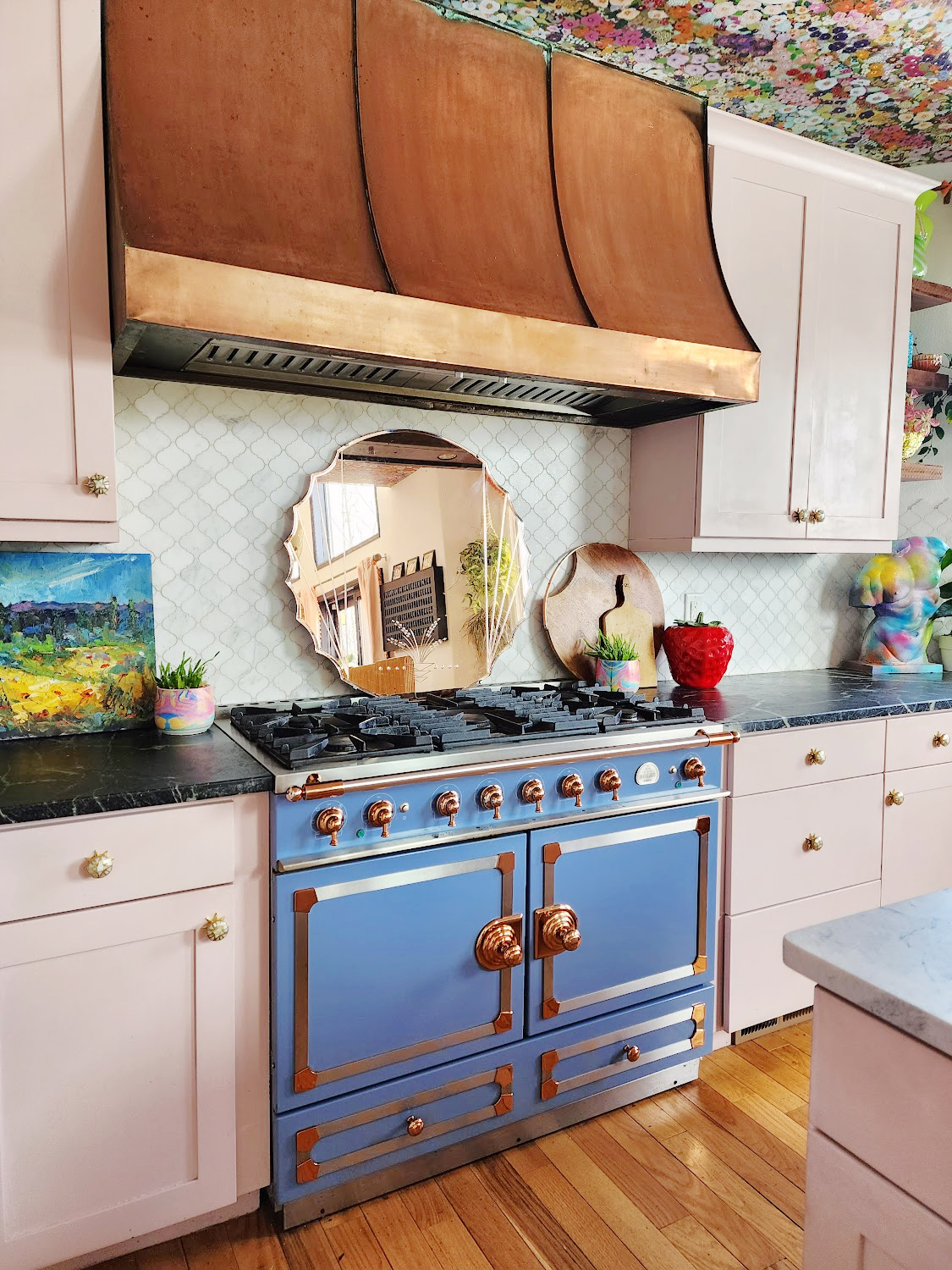
The art to the left of the range is a thrifted oil while there’s an estate sale strawberry cookie jar and some wood cutting boards that warm up the other side.
To the right of the range is our bay window area. Previously there wasn’t any drapery on the windows just the hanging plants. But when I saw the wallpaper up I knew it needed something warm.
After staring at it for awhile I came up with this idea, pink drapery with orange fringe just across the top. Prettier than a standard valance but enough to carry the pink around and draw the eye up without sacrificing light from the windows for my plants.
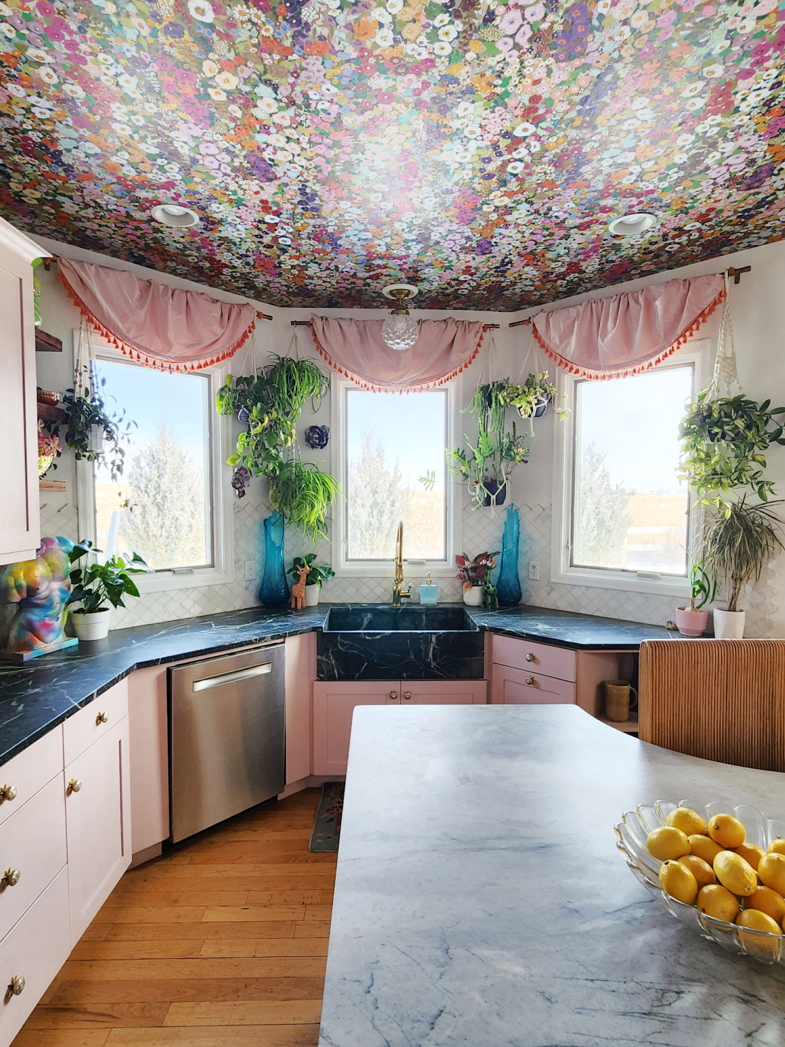
I actually made these in a matter of minutes and it was free! I had some leftover drapes (Opalhouse from Target) that I wasn’t using (the same drapes hang in the family room just outside the kitchen). I folded them in half lengthwise and then cut them in half horizontally.
I’m not a sewer by any means so I literally just climbed up with my half a curtain and started draping, folding and floofing until I liked how it looked. Repeat on the other 2 windows and you have a custom look with a very antique vibe.

I’m actually stoked with how they turned out, it was just a vision in my head but sometimes they don’t always work well. 😂
Above the rainbow torso to the left of the window I have a few more shelves that I restyled with vintage glassware in rainbow shades.
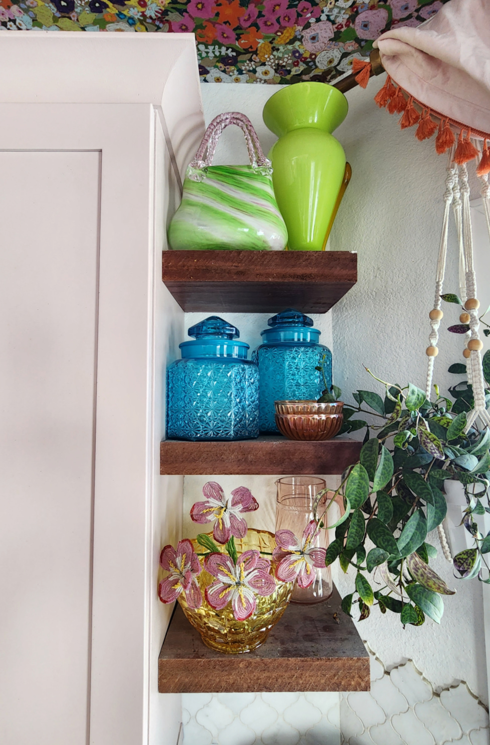
All of these pieces were also thrifted. Clearly I have a glassware problem
I can’t stop staring up now. It’s everything I hoped it would be and so much more.

This is House of Hackney’s Hollyhocks print in the colorway Spring
I forgot to mention that I also swapped out the lighting. We capped off the other 2 junction boxes over the island and I went for this vintage fixture I recently thrifted for $15. I like the more simple look with just one fixture and surprisingly, this gives off way more light than the 3 pendants did.
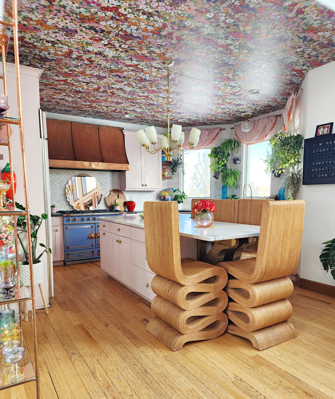
I’m happy with this room now, much to the relief of my family who get nervous when they hear me say “I have an idea..”
The touch of drapery, the rainbow glass the warmth of copper and brass. And don’t forget about textures like the rattan stools, fringe and plants. Texture brings so much to the table!
I think this is my favorite version of our kitchen ever. What do you think? Would you ever wallpaper your kitchen ceiling? Or use a bold print like this?
I always love to hear from you so hit me up in the comments with questions or thoughts.
And don’t forget to pop your email into the subscribe box, you’ll be the first to know when a new post goes live.
Next up I’m talking the trend for 2024 and I’m actually excited about this one!



Connie
January 16, 2024Awesome
Tina Bousu
January 17, 2024Thank you so much Connie!
Debbie
January 16, 2024I have been anticipating this and it was worth the wait. Wow, just wow!! The Hollyhock paper is perfect, all of your rainbow glass is so in tune with the ceiling and the window treatments! I’m dead. They’re perfect, and you just threw them up there? I love every single thing about this room, you totally knocked it outta the park!!
Tina Bousu
January 17, 2024Debbie, thank you so very much! I waited so long to do this and finally went for it, now I wonder why I waited. 😆 The rainbow glass was a big part of the inspiration to go for this print, all the colors are so pretty I just wasn’t happy with 1 or 2. Here’s to a fun and vibrant space and thanks again for your incredibly kind words! ❤️
MaryJane Konczyk
January 23, 2024Love it! Your style and vibe is just the best. Feel like I’ve found my soul sister. Great ideas—big inspiration to me 🙂
Tina Bousu
February 6, 2024Hi! Thank you so much, it’s so nice to meet a fellow color lover!
Kim
March 19, 2024I love your style, creativity and spunk! No holding back for 2024!
Tina Bousu
March 21, 2024Hi Kim, ahh I’m so glad you like it! Yas no holding back baby!! xoxo
Diane
March 22, 2024I LUV the kitchen wallpaper. The islands chairs are bit too big for me, they kinda take over. But ur house, ur home, ur happy, All in all, I like!